Direction Signs: A Playful Dingbats Font for Web Design
I was deep into a redesign for a boutique travel coaching website last week when I hit that familiar wall. The layout was clean, the color palette was soothing, but the user flow felt sterile. The hero section needed a spark—something to guide the visitor's eye without screaming for attention. That is when I decided to test Direction Signs, a fun and practical dingbats font that goes beyond standard letters. Instead of relying on generic SVG icons or heavy icon libraries, I wanted to see if a character-based approach could add a playful touch to the designs while effectively guiding attention through the page.
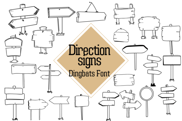
As a digital product creator, I am always cautious about introducing decorative elements. They can easily clutter a responsive layout or hurt accessibility if not handled with care. However, Direction Signs offers a unique personality. It is filled with a variety of directional symbols that feel hand-crafted yet precise. When I dropped it into the CSS stack for the headline area, the transformation was immediate. The arrows and pointers didn't just sit there; they created a visual rhythm that encouraged scrolling. This typeface proves that dingbats are not just for print flyers; they have a legitimate place in modern web design when used with intention.
Integrating Symbolic Typography into Digital Layouts
The core appeal of Direction Signs lies in its versatility as a display font. Unlike a standard sans serif font used for body copy, this typeface demands to be seen. In my project, I used it primarily for section dividers and call-to-action accents. For instance, instead of a boring horizontal rule between the "Services" and "Testimonials" sections, I used a repeating pattern of the font's arrow characters. This broke up the white space and subtly pushed the user's gaze downward, improving the scanning behavior of the page.
When working with fonts of this nature, context is everything. I found that Direction Signs worked exceptionally well in the header navigation of a creative portfolio site I was mocking up simultaneously. By replacing standard bullet points or chevrons with these custom glyphs, the menu felt more like a curated journey than a static list. It added a layer of brand identity that felt cohesive and thoughtful. For online store owners or course creators, this level of detail can differentiate a generic template from a polished brand identity.
However, one must be mindful of readability. While Direction Signs is fantastic for headlines, buttons, and short phrases, it is not designed for long-form text. Using it for paragraph content would be a disaster for user experience. I treated it strictly as a creative font for decorative accents and logo design elements. In the hero section of the coaching site, I paired the directional symbols with a bold, geometric sans serif font for the main headline. The contrast between the functional text and the playful symbols created a balanced visual hierarchy that felt professional yet approachable.
Enhancing User Experience with Visual Cues
In the world of UI design, guiding the user is half the battle. Direction Signs excels here because it communicates movement inherently. I tested it on a product landing page for a digital brand kit. The goal was to lead the eye from the value proposition down to the "Buy Now" button. By incorporating the font's arrows as subtle background patterns or inline elements next to key benefits, I created a path of least resistance for the user. This technique is particularly effective for campaign landing pages where conversion is the primary metric.
Mobile responsiveness is another critical factor. When I previewed the layout on smaller screens, I had to adjust the font size and line height of the Direction Signs elements. On desktop, a large arrow might look majestic, but on a smartphone, it can dominate the screen and push content below the fold. I learned to use these glyphs sparingly on mobile, perhaps limiting them to the main hero image overlay or the footer. The key is ensuring that the symbols remain crisp and do not pixelate, which speaks to the quality of the webfont file formats included with the package.
Furthermore, the mood of Direction Signs is undeniably upbeat. It brings a sense of motion and energy that static images sometimes lack. For a blog redesign I was consulting on, we used the font to create custom pull quotes. Instead of standard quotation marks, we used a stylized pointer from the font set to indicate the start of the quote. This small change made the editorial design feel more dynamic and engaging, encouraging readers to stop and absorb the highlighted text. It is these micro-interactions in design that build trust and keep users engaged.
Strategic Font Pairing and Technical Considerations
No font exists in a vacuum. To make Direction Signs shine, you need a solid partner. I highly recommend pairing this dingbats typeface with a neutral, highly readable serif font or a clean modern typography staple for the body text. If your body copy is too decorative, the combination will feel chaotic. The goal is to let Direction Signs be the star of the show while the supporting text provides stability. For a SaaS founder or entrepreneur building a personal brand, this balance communicates both creativity and reliability.
Before implementing any new asset into a client project, checking the licensing and technical specs is non-negotiable. Direction Signs comes as a commercial font, meaning it is cleared for use in online stores, digital templates, and client websites, provided you adhere to the specific license terms. I always verify the available weights and styles. While this is a symbol font, knowing if it includes alternates or different stroke widths can expand your design possibilities. Additionally, ensuring the webfont loads quickly is vital for performance. A slow-loading font can ruin the user experience, so optimizing the file delivery via CDN or local hosting is a best practice I always follow.
Ultimately, incorporating Direction Signs into your toolkit is about adding a layer of human connection to digital interfaces. Whether you are designing a course sales page, a social media graphic, or packaging design mockups, these symbols offer a way to communicate direction and intent without words. They remind us that web design is not just about information architecture; it is about creating an emotional response. By thoughtfully integrating these playful elements, we can build online experiences that are not only functional but also delightful to navigate.
If you are looking to refresh your digital brand kit or add some flair to a stagnant landing page, experimenting with a specialized typeface like this can yield surprising results. Just remember to keep the user's journey in mind. Use the arrows to point the way, the symbols to break the monotony, and the style to reinforce your brand's unique voice. With the right application, Direction Signs transforms from a simple collection of glyphs into a powerful tool for visual storytelling.